Screenshots
A picture is worth a thousand words, so feel free to make liberal uses of screenshots and other images in your content. But, there are good pictures, and there are slightly less good pictures. Here's a few examples (and apologies to those being made example of, it's all for the common good!):
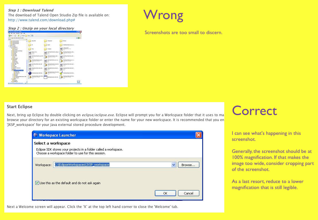
Above, we see two screenshots of software GUIs, both of which featured in how-to articles. With the second screenshot, the author can reference elements of the screenshot in the text, so the reader can jump back and forward between text and image. (Better yet, the author could annotate the image, e.g. with text, reference numbers, or callouts, etc.). However, in the first screenshot, the resolution is too low to be of use; none of the text or icons in the screenshot can be discerned. Generally, you want to use screen shots at original screen resolution. If the image then becomes too large (usually width is the issue), then consider cropping the screenshot to the most relevant parts, or perhaps break the screenshot up into smaller sections. As a last resort resize the image (e.g. to 80%), but only if the screenshot details are still discernible enough to be of use to the reader.
On to an entirely different issue, what's wrong with this screenshot?
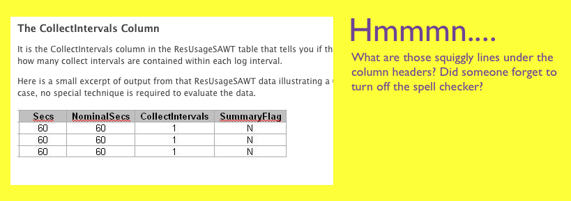
Make sure your images are production-ready. Here's a perfectly good table... with squiggly red lines. Turn off that spell-checker! Take the time to review your images and ask yourself do they look professional? If there are multiple images in your content, do they all have the same style? (E.g. with a bunch of spreadsheet screenshots, am I using the same colors throughout?) Did I accidentally include a piece of my desktop wallpaper with Fido smiling through?
How about this fellow below?
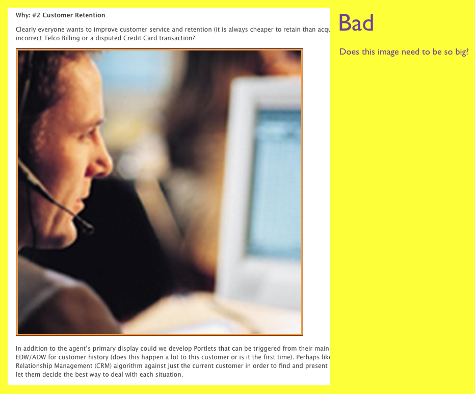
Whilst this dude may represent technology and progress with his headpiece and intense facial expression, I don't need him to take up my full browser window. 200 by 200 pixels would have done fine...